Man, Monster & Machine
Brief: Design a factual magazine that celebrates the impact of silent film on modern cinema.
This premium magazine aims to highlight the genre of German Expressionism within silent cinema and the renowned directors behind some of the most iconic monsters and robots in cinematic history. To illustrate the impact of German Expressionism on modern cinema, colours commonly associated with 3D films were juxtaposed with the traditional style of dramatic wood-cut illustrations. The foundation of these pages is designed to predominantly feature matte black paper, as this would represent the inter-titles used in silent films.
Research
When selecting German Expressionism in silent films, the concept of highlighting the directors emerged. To gauge the awareness of this target market, comprising 18-30 year olds, a social media survey was conducted. Surprisingly, 100% of respondents revealed their lack of knowledge about German Expressionist directors. This underscores the significance of undertaking such a project. The goal is to introduce these directors to this audience in an engaging and captivating manner, allowing them to explore the world of famous monsters and machines in the horror genre, and their profound influence on contemporary cinema.
German Expressionism is characterised by its use of sharp imagery and shadows to create nightmarish scenes. Common themes found in typical German Expressionist films include:
- Warped landscapes, particularly distorted windows.
-A focus on the expression conveyed in the eyes.
-The use of multiple typefaces in title sequences.
-The distortion of reality through shadows.
-The exploration of a man’s descent into madness or trickery.
-Society’s fear of monsters or machines taking over, portrayed through imagery.
Typefaces
The primary title font employed is ‘Die Brucke’, which embodies the essence of German Expressionism through its condensed and distorted style. For the body text, ‘Roboto’ was chosen for its simplicity and versatility. Its rounded body complements the sharp lines and expressive tone of the titles and subheadings. Due to the documents substantial size when printed, the font is also set as 10pt. While typically used in its thin setting, the typeface will be adjusted to light when paired with a vibrant background to enhance readability. When referring to a movie title, the text will be converted to italics instead of using singular quotes so the text doesn’t read as disjointed. This stylistic choice is then paired with a typewriter font in the footer, which is commonly associated with the 1920s and its crime/horror genre. The other typefaces used were employed for expressive purposes in the main quote spreads.
Illustration
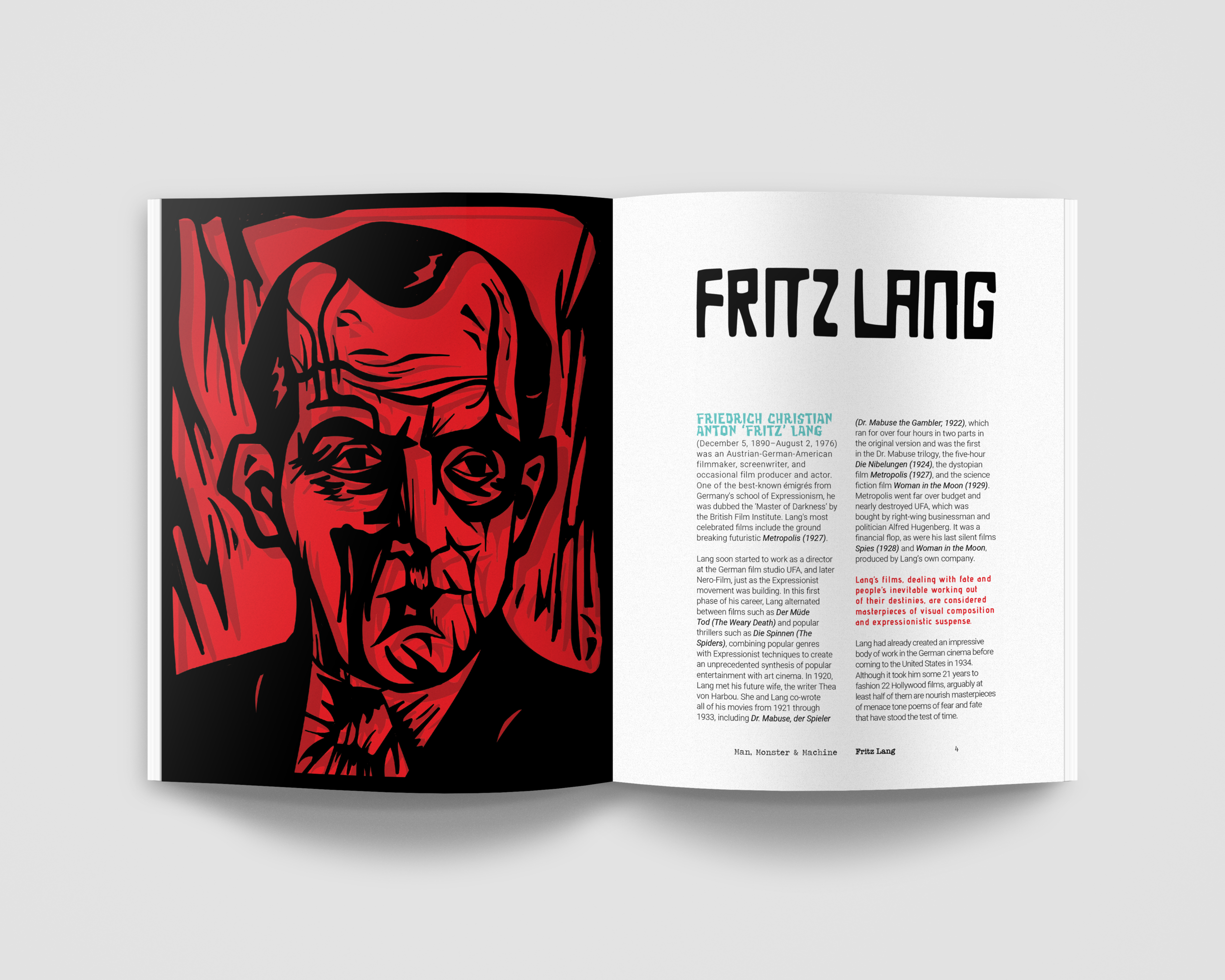
Each chapter to the magazine begins with an illustration of the director, and the monster features in their film. These illustrations are designed to resemble woodcuttings, characterised by sharp lines and rough features. A dark shadow will be cast behind the black illustration, paying homage to the German Expressionists’ use of shadows in film. To distinguish the director from the monster, the director will be depicted in red, while the monster will be portrayed in blue.
Cover
The magazine’s cover immediately reveals its illustration style, setting the tone for what readers can expect inside. This captivating image depicts the iconic monster from Robert Wiene’s classic film, “The Cabinet of Dr. Caligari.” The monster’s direct gaze at the reader ensures that it will capture their attention, making it an ideal choice for a shelf display. The title, “Man, Monster & Machine,” is positioned between the monster’s eyes and mouth, creating a visually striking contrast. The back of the magazine is then designed to resemble end title credits, providing a clean and organised finish.
Interior
The interior pages will feature a combination of black and white pages, interspersed with a harmonious blend of the primary blue and red hues. Each page was crafted to convey as much expressionism as possible, aiming to infuse the text with an artistic sensibility while ensuring the necessary borders for all publications. The magazine itself is enveloped in a striking double blue spread, adorned with a singular eye illustration. This design adds a touch of luxury and provides a clear distinction between the beginning and the end of the publication. The choice of a wood-cut illustration of the eye was deliberate, as it holds significant symbolic importance within the German Expressionist movement in film. Within the pupil, a window-like shape is employed, symbolising the eye as the gateway to the soul—a central theme that resonates with the directors featured in the magazine.
The simple yet versatile 260 x 210mm page format, with its two grid structure, offers remarkable flexibility, particularly for double-page quote spreads. A fundamental principle guiding all page layouts is that the text must adhere to the outer margins. This approach ensures that the magazine maintains an expressive and visually appealing appearance, closely replicating the style of German Expressionist art and cinema.


Binding
The premium magazine’s cover and back are made of 1.5mm board, giving it a collectable appearance and will have exposed red polycotton thread binding. This not only compliments the rough textures of the magazine’s theme but also allows the pages to lay flat, which is essential for the double-page quote spreads. Thread-sewn binding is known for its durability and high-quality, making it ideal for long-lasting publications.


